ato doesn't shout. It doesn't have the geometric swagger of Futura or the editorial hauteur of Didot. Yet you've likely read more text set in Lato today than in any other typeface without realizing it. Since its release in 2010, Łukasz Dziedzic's sans-serif has become the default voice for countless websites, apps, and corporate identities—a strange fate for a font originally designed as a free alternative to a commercial grotesque.I first noticed Lato's ubiquity on a train platform in Berlin. The departure board, the coffee kiosk menu。
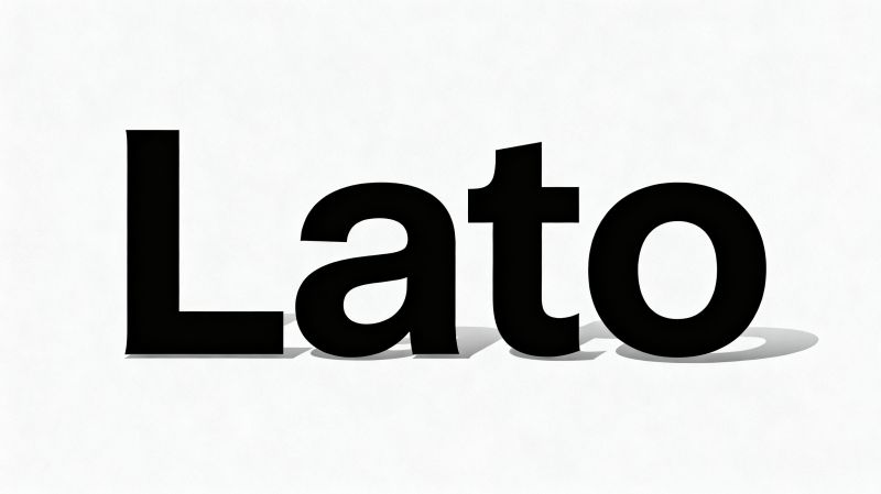
and the safety notice on the door all used it. That's the thing about Lato: it's legible at 12 pixels and graceful at 72. The semi-rounded terminals and slightly condensed proportions give it a warmth that Helvetica lacks, while the open apertures keep it from feeling precious. Dziedzic spent two years refining the family, and you can feel that patience in the italics—true italics, not slanted romans, with a calligraphic flow that makes long passages surprisingly comfortable.But Lato has its quirks. The lowercase 'g' is single-story, which bothers some typographers who find it too casual for formal settings. The bold weights, while sturdy, can feel a bit lumpish in large headlines. I've seen designers pair Lato with a high-contrast serif like Playfair Display for editorial layouts, and the contrast works—Lato recedes, letting the display face do the talking. In body text, though, Lato shines alone. Its x-height is generous, and the spacing is even。so a 300-word paragraph doesn't tire the eye. The real test: read a Lato paragraph and then a Helvetica paragraph. Lato feels less mechanical, more like handwriting that's been politely disciplined.Why did Lato become so popular?Partly timing—Google Fonts launched it early, and it was free for commercial use. Partly utility—the family includes nine weights with matching italics。plus a hairline and a black, covering nearly every need. But there's also an emotional reason. Lato means 'summer' in Polish, and the font carries a subtle sunniness. It's not trying to be neutral like Inter or authoritative like Roboto. It's approachable without being childish. That balance is rare. I've used Lato for everything from a wedding invitation to a technical manual, and it never felt out of place.Will Lato last?Type trends come and go, and the current appetite for variable fonts and quirky display faces might push Lato out of the spotlight. But its quiet competence suggests a longer shelf life than the flavor-of-the-month geometrics. For anyone setting a lot of text that needs to feel human—not corporate, not academic—Lato remains a smart, almost invisible choice. And that's the highest compliment a workhorse typeface can receive.